Why is this strange guy writing on the Brisbane Copywriter website?
Your friendly neighbourhood copywriter (that’s Emily if you didn’t know already) recently posted the following on her Facebook page:
SURVEY: What’s your PET PEEVE when it comes to websites? Do you hate extra long forms, having to create super crazy long passwords, pop-ups, or something else? Let me know!
I thought for a while and couldn’t really narrow it down to one. So like how Gimli (son of Gloin) asked the Elven Lady Galadriel for a hair from her head (only to receive three), Emily asked for a pet peeve, and I gave her ten. Then just like in Jurassic park, the gender roles were reversed too but that’s fairly irrelevant for this story.
Emily asked if I would do a guest post here. So I did.
I’m Caillin
So who am I? Well I’ll ignore the deep philosophical questions involved with that and just say that I’m Caillin and I’m an engineer. Despite what you may read in a Dilbert cartoon (like the one below which also, at it happens, is stuck on the side of my work computer), we’re not all abnormal so please don’t hold it against me.

My Website Pet Peeves
To make my website pet peeves a bit more human friendly than they were on Facebook, I’m going to change the formatting a bit and sort them into categories rather than have a rats-nest of square brackets and parentheses forced to work with an ordered list.
I’ll just point out, that these website pet peeves (I really should start using an acronym for this) are from the point of view of an engineer, rather than that of a web-designer or a copywriter or an advertising executive. Because I’m an engineer there is the engineer slant on things. The examples appeal to me as an engineer. The rants are written in as diplomatic a way as possible.
My website pet peeves fall into three major categories:
- Forms
- Content
- Eye candy
Forms (including passwords)
I’ll start by talking about forms that are unhelpful. Does your form give the wrong information, or simply not enough? If you answered yes then it’s likely you’ll be covered by this pet peeve.
I’ll lead with an example. Suppose you are making a registration form which contains a field for a password. Being the form architect you are (look if Subway can call their workers “Sandwich Artists” I can call form designers architects) you put some restrictions on the password. You might code it to reject passwords that are shorter than 8 characters (for security) and longer than 16 characters (for space reasons). Do you tell your users that you’re doing this?
If not, why not? Do you want to annoy your users? Perhaps you’ll assume that most passwords chosen will fit the rules anyway so you’ll only tell them if they choose one that doesn’t work?
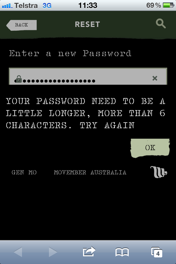
A story: I was recently setting a password on a website (the Movember password change page). I was using my phone to do this as that’s what was on hand (Emily has previously talked about making sure your sites work on mobile devices). I type in a password that was 17 characters long. Hit submit. I get a nice error telling me that my password needs to be longer than six characters. Yep that’s right, my 17 character password is apparently not allowed because I need a password longer than six characters. I then swapped to my laptop, used the same password, and got a much more helpful error (that my password had to be less than 16 characters). Much more helpful, but it does show that something is wrong when the same password gives two different errors on two different devices.
So I could show this happening I did it again and used a 19 character password to take a screenshot.

I tried to replicate it again on my laptop, but it refused to let me try and reset my password using a link they had only just emailed me claiming that it was already used. Go figure. You can see why I put this here right? That is definitely not a helpful form.
Another related example is how hotmail used to be. You used to be able to set your hotmail password to be longer than 16 characters. It would accept it and tell you it was set. When however you tried to then log-in to hotmail with a separate email client (to get email via POP3 for example) it gave an error. It turns out that the passwords were limited to 16 characters and it just didn’t tell you that it was truncating longer ones.
The second item in this category is forms that enforce small password limits. I can see the logic behind limiting passwords to short lengths if space is at a premium, but in this day and age it’s only really a user convenience issue stopping them choose a longer password. It can also be a security issue (have a read about rainbow tables for information on why). If I want my password to be longer than 8 characters, I should be able to. For instance my longest password is 30 characters, and I have a few 8 character passwords by necessity. Centrelink for example mandates a password that must be alphanumeric (that is, it must include at least one alphabetical character and one number) and be between six and eight characters long. [And (like the example below)] is not case sensitive.
Third is again related to passwords. On many (I’d say most) websites, passwords are case sensitive, that is “MySecretPassword” is different to “mysecretpassword”. Now you’d expect certain websites (online banking etc) to be more secure than others. This is not always the case. Take for example the Commonwealth Bank.
Their password rules (as shown on the NetBank password change form are as follows:
- must be between 8 and 16 characters long
- must contain both letters and numbers
- must be different to your previous 5 passwords
- should not contain a recognisable part of your name or your date of birth
- must not contain your NetBank client number
- can contain most characters except <>^`{}~=
Now granted it doesn’t actually say that it’s case sensitive, but for years (until June 2012) I assumed (incorrectly) that it was anyway. That’s right, despite all those other password rules, Commonwealth Bank’s NetBank does not use case sensitive passwords. If you’re with the Commonwealth Bank and use NetBank you can try it yourself and see.
The password change demo says it’s not case sensitive (in the demo) but within NetBank it doesn’t state that.
What does the Commonwealth Bank say? They claim it doesn’t matter essentially saying that they trust their other security measures and that customers are covered for unauthorised transactions anyway. I’ll also point out, that depending on their server configuration, it might actually require MORE coding to remove the case sensitivity rather than less.
Website Content
Many websites float content (including adverts) over their text so that as you scroll down, the content (or advert) floats down with it. The Lifehacker link above shows an example of this floating content. Now on the side it’s not as much of an issue, but some sites put it over the text itself. This is particularly a problem on mobile devices where you then end up having to read the content using only a few lines of visible text. If you’re able to close these then it’s not so much of a problem. This is where I prefer (as in the lesser of two evils) popups.
Now we come to one of my major website pet peeves, websites which auto-play content. News Limited websites do this. You get a 5 second countdown and then it starts. If you miss the button to stop it playing and accidentally click on the video it starts. If you miss the countdown it starts. If you don’t know the video exists and have it opened into a new tab while continuing your reading of the current page, it can start. For an example see this News Limited article on an answer given on the TV show Family Feud, or the images below. 

Note that autoplay defaults to on. You can turn it off, but that requires registering for an account first. Some websites auto-play music as part of the theme of the website. The example I gave on Facebook was that I would not mind as much if a website on 17th century Russian folk music had some quiet background music playing (as long as there is a way to stop it).
Too much flash. Now in this situation, by flash, I mean the Adobe/Macromedia content delivery method. Passing over the issues with flash and google indexing, flash chews up computing cycles and in many cases is not actually needed. I’m not talking about flash based game websites, I’m talking about your bog-standard website that has very little non-text content. Autoplaying video content (see previous point) and advertising are major sources of this. Put simply if you have so much flash content that your web-browser (and computer) become unusable if you leave a tab open, you have too much flash for my liking.
Entry pages. You’ve probably all seen them. You go to a website and have to click “continue” or “enter” or an image to get to the actual content. For an example of this see Drew’s script-o-rama. In that case, it is there so you can choose which version of the website you see. The satire website 27bSlash6 used to have one too which was the simple “click to continue” type. Now I want it clear that I don’t have a problem with entry pages in and of themselves, especially if the website may contain content unsuitable for certain audiences (whether due to language, violence, nudity, etc). What I do have a problem with, is websites which force all users to their entry page before viewing other content. If I want to visit (this website is used as an example, I have not checked if it is real and what the content may be) http://www.bovine-fun.com/cowtipping.html I want to end up on a page with information on inverting unsuspecting cattle. I don’t want to end up on the bovine-fun entry page (or home page). Sometimes sites will do this due to the need to login to the website, or confirm that you are knowingly going to visit the potentially unsuitable content. If the site or entry page (once you’ve logged in) redirects you to the requested page, it’s all good. If it instead dumps you to a “thank you for logging in” page or the home page. It’s not so good. In fact, it’s a pet peeve.
Error pages should provide useful information. I know that an error 404 means that the content is unable to be found, and that an error 500 means that there’s an issue with the server configuration itself, but not everyone does. That doesn’t matter though. If I get an error 404, I want to get something useful out of it. Some websites will just show the error, maybe with some eye candy (see next section).

Some websites will configure their 404 pages to search for what may be related pages and show a list. Some just provide a search box for you to search yourself.

Others still provide a link to go back to the previous page.

It’s this last point that creates this pet peeve. The “back” button in the browser doesn’t always work. This is especially true with dynamic content. For an example of where the browser’s back button doesn’t show you the previous content is Wikipedia‘s Random Article feature (Yes it will go to a random article. No I don’t know which on you’ll get). On the Wikipedia page it’s in the left menu. Use it to view a few random articles, and then use your browsers back button to try and view the previous random article. Say hello to the homepage again. (Hello Mr Homepage). Not not everyone will have enough access to the server on which their website is hosted to modify their 404 page, but if you can there is a lot you can do to make your error pages (and other pages) have nifty features, including being able to send your reader back to the page they just came from, thus reducing the need to rely on unhelpful browser back buttons.
Eye Candy
The guy with the 6 pack walking down the street. The athletic girl you see in the gym every night at 6pm. The Windows Aero and Metro interfaces. These are examples of eye-candy. Simply put, things that are pleasing to the eye. The two things listed here cannot really be ranked. They are both important, and both can very quickly turn people off your website. The first one I’ll discuss is the bad choice of text and background colour. Here are two examples of where this is important: Firstly we can see purple on brown
Purple on brown is not nice ok 🙂
and then green on yellow
green on yellow is slightly better but still not great
Seriously don’t do it! There are plenty of other colour combinations that can pretty up your site and still be readable.
blue on white
white on black
yellow on black
black on yellow
red on black
red on white
I’m not telling you to go out and make a page with any of these colour combinations (if I did that I might end up with a certain Brisbane-based copywriter knocking on my front door), just that they are readable, and readable is good.
Also, I’d avoid overusing marquees.
Now we come to the final pet-peeve for this blog post. Non-wrapped text is bad. Wrapped text is good.
For an example of this, I’ll turn once again to News Limited (I have many other issues with News Limited, but that’s for another time). To demonstrate I’ll compare their mobile (top image below) and non-mobile (bottom image below) versions of an article. Their mobile versions seem to do nice text wrapping. Load up this mobile version (it’s ok, it will work on your desktop/laptop) and resize your browser window. Notice how (just as in Emily’s “HO” post) the text wraps itself around to accommodate the different browser size? Great, hey. However now visit the non-mobile version. Once again, resize your browser window. This time however notice how the text doesn’t move around and you need to scroll? Yeah. Annoying, isn’t it.


Not as annoying as it could be. Sometimes the text will not wrap, but then will be hidden by other content so you can’t read it even if you scroll.
So there you have it. Ten things that can make me as an engineer hate your website.
I’ll finish by noting that despite my rants aimed at certain companies and certain 3rd party websites being mentioned in my post, I have no issues with the companies themselves (though I do think that News Limited need to spell and grammar check some of their stories a bit better), and this post should not be taken as advice to stop using Centrelink, the Commonwealth Bank or News Limited.
So what do you think? Do I whinge too much? Do I whinge too little? Do you have any Website Pet Peeves? Have you seen any good movies lately?